Issuu Stories

The inherently-horizontal layout of magazines posed a unique challenge with displaying content on a handheld vertically-oriented screen.

So we came up with a plan to fix that—our goal was to make our publisher’s awesome content easier to digest from a phone.

The Outcome

We launched our mobile "Stories" view and it experienced overwhelmingly positive adoption from our top publishers. It's still being used today and is one of the cornerstones of what sets apart Issuu from other online readers.

23
publishers opted in within the first month
119
stories created (as of 2018)
11
months, start-to-finish

Going beyond the cover

Issuu is a platform for people to publish digital magazines.

Roughly 3.5 million people publish their independent content on Issuu and reach more than 100 million monthly unique visitors. However, more than half of those visitors are on their mobile phones.

The responsive HTML-5 reader window does a great job of showcasing a digital version of the magazine on laptop and tablet screens, but the inherently-horizontal layout of magazines posed a unique challenge with displaying content on a handheld vertically-oriented screen.

So we came up with a plan to fix that—our goal was to make our publisher’s awesome content easier to digest from a phone.
Previous mobile reading experience

New mobile reading experience

Talking with publishers

User-centered design is inquisitive, not prescriptive. So I started off by talking with a variety of publishers to better understand their goals and why they structure their content the way they do.

Main findings from talking with publishers:

  1. Every magazine is a compilation of unique stories.
  2. Many Issuu account holders are one- and two-person teams, which means they’re very busy and would benefit from quick easy steps.
  3. There was high interest in the ability to customize and control the individuality of their content.
  4. Every publisher shares their content multiple times in an effort to highlight the various pieces of content behind the cover – they were currently doing this with the “share from page” feature and writing custom content with each post to social media platforms.

Key takeaway:

Keep the process simple, and give each unique story the ability to shine.

Diverge, then converge

After gathering feedback, I poured through other platforms that allow selecting ranges of items—everything from managing calendar events and e-commerce checkout experiences, all the way to image and video editing editing software.

I believe good input leads to good output, so the goal of this was to expand my understanding of the solutions that currently exist and put all the ideas on the table. From there, I can start juxtaposing pieces. This part of the process is fun because it makes me look at common experiences through a different lens. I always end up gleaning inspiration from an experience that would’ve made me raise my eyebrows before.

Now that I had some ideas around how the content beyond the cover is structured, I dedicated two steps to the Stories creation process:

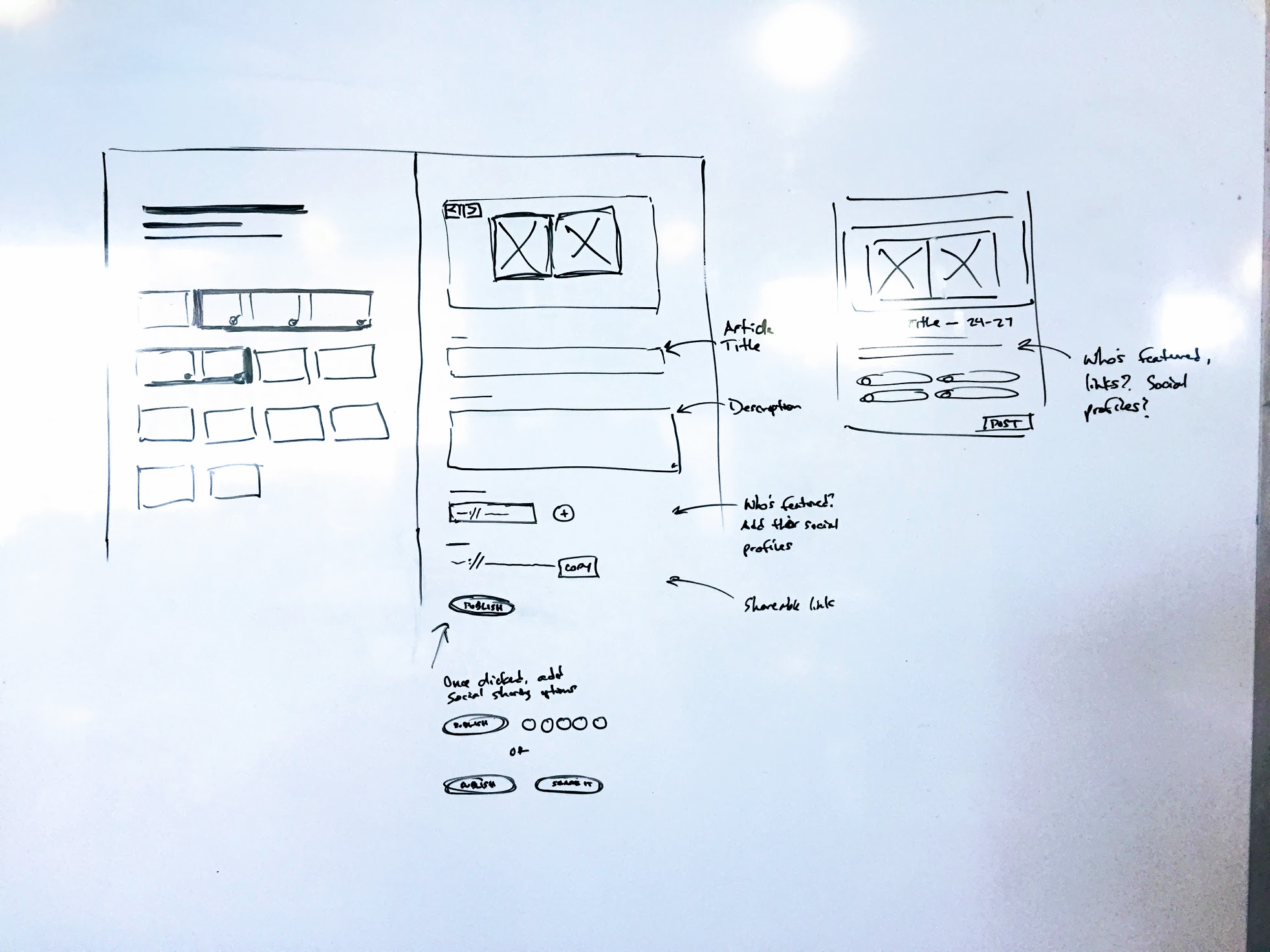
Selecting Page Range

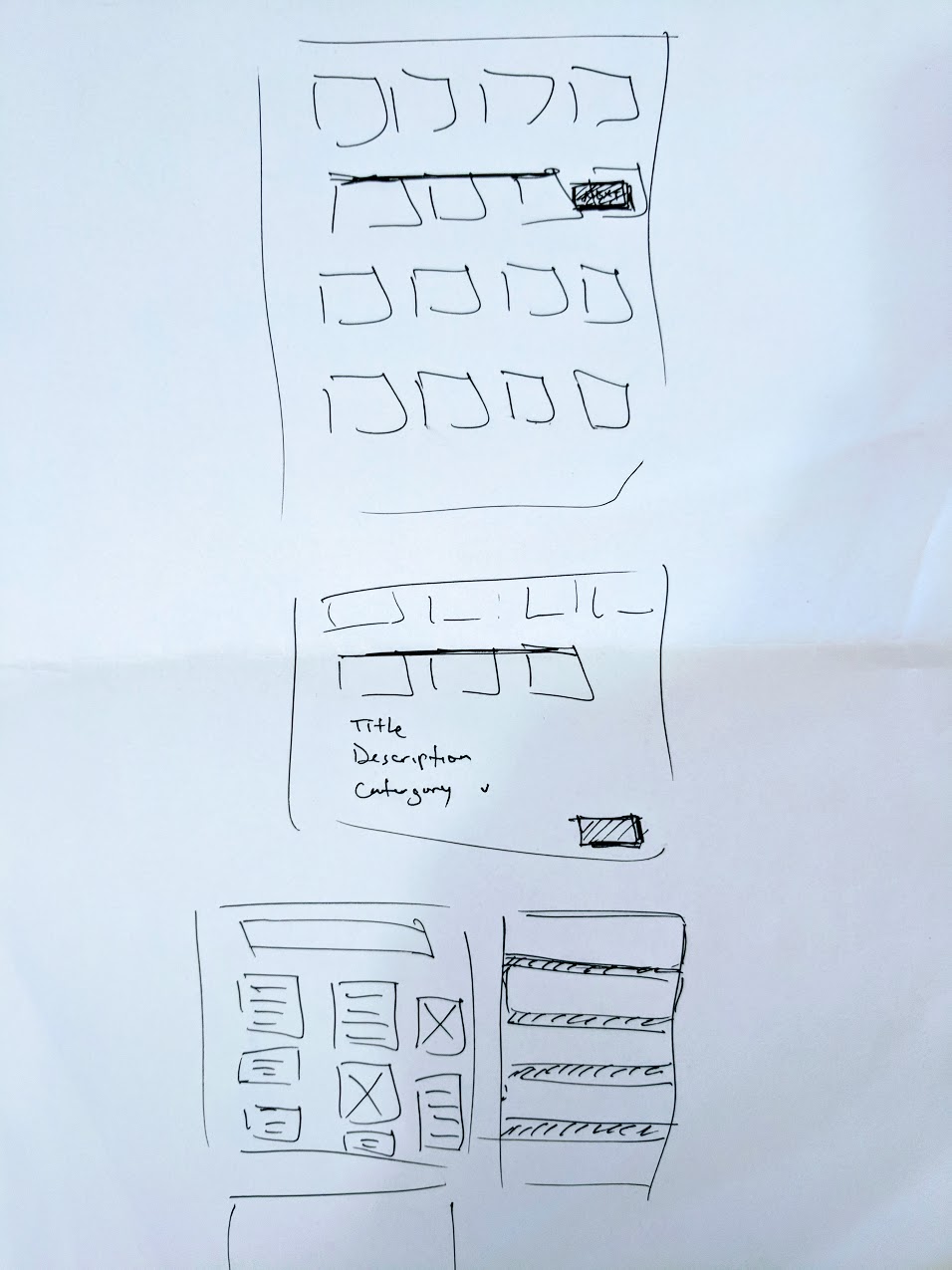
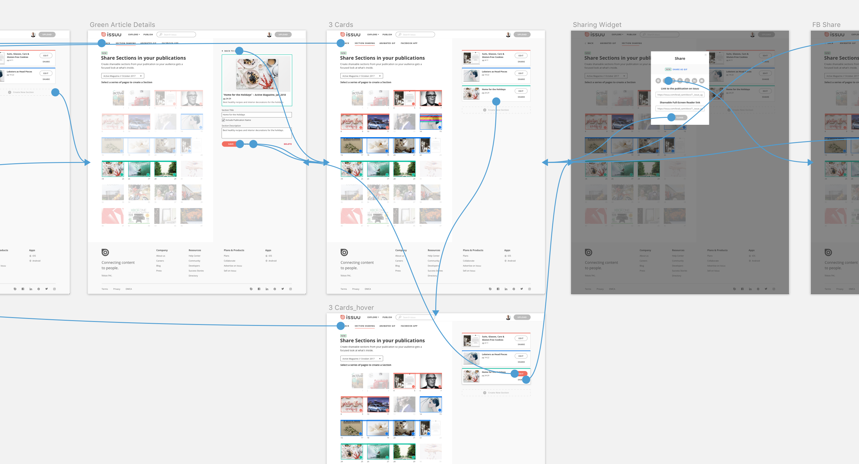
Allow publishers to mark a series of spreads as a “section” with its own unique title and description, so it could be shared individually.

Optimizing the Content

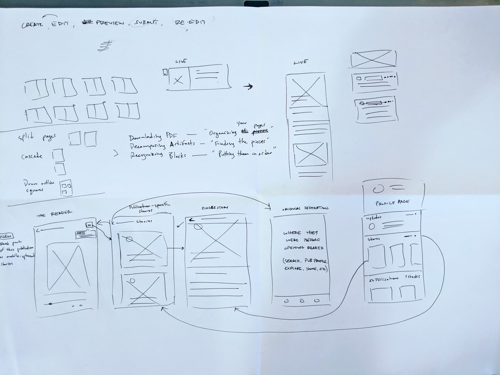
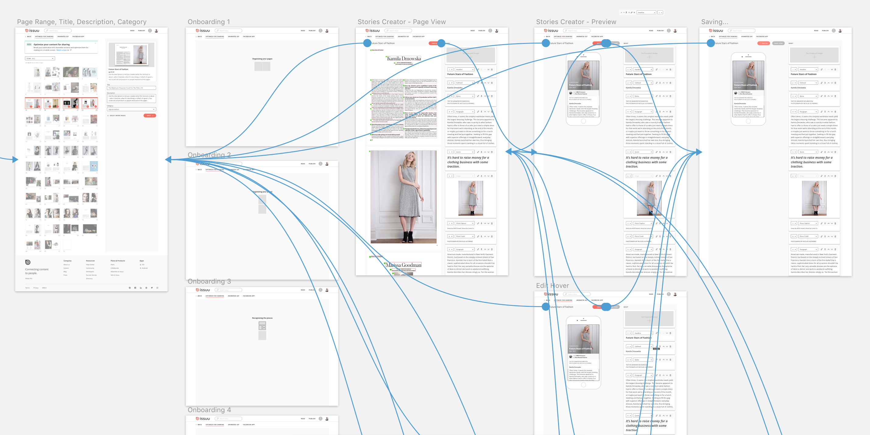
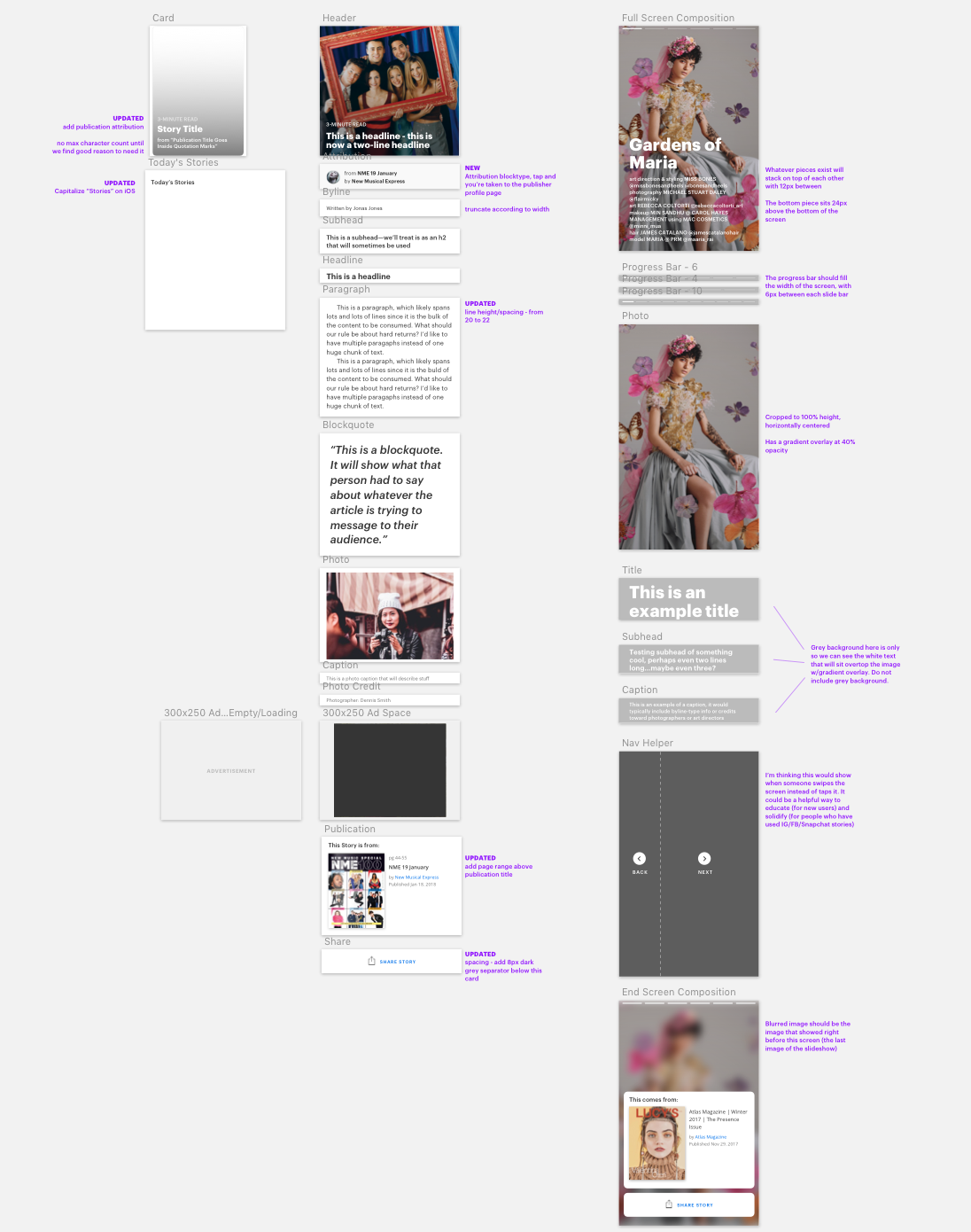
Take the previously-marked pages and reflow the text blocks and images into a mobile-friendly layout.

Selecting page range

I worked in tandem with Cameron (UX Design Director) and John (VP of Product Design) to bounce ideas back and forth until we came up with some interesting concepts and user flows based from our research.

I translated these concepts into journey maps to make them easier to describe and pulled in Engineering Leads (for .com & native app) to get a better picture of what kinds of tech we could leverage to build a quick prototype and test our ideas. They also helped me understand the relative timeline regarding certain feature ideas so we could find clarity on must-have functionality vs nice-to-have micro interactions.

The next step was to build a rapid prototype so we could gather feedback from our publishers and readers.

Optimizing for mobile

For this step, I worked closely with our mobile app team to build a decomposer so we recognize the pieces of text and imagery on individual pdf pages. We tried a few options and found a Google Vision API capable of doing what we needed and began building an internal tool to test it’s abilities.

Once we had a working internal tool, we reached out to some publishers for permission to experimentally reflow their content and iron out some kinks along the way.

In the meantime, I took the reigns on the front-end and created some “blocktypes” for rudimentary customization—this design was inspired by playing with a lot of word processors and content organization tools like Medium, Squarespace, WordPress, and lots of tools in the Google Suite.

Gathering feedback

We wanted to validate the Stories idea before investing a ton of resources into streamlining the UX, so we set out to “build a skateboard” before “building the car” (more on the MVE approach here)

We launched the first version of Stories on May 8 and I’m working hard with the UX, Customer Success, and Engagement Metrics teams to learning from publishers and readers how the experience can be better.