Web Composer 2.0

After over a decade of code maintenance and refactoring, we’d decided to rewrite facebook.com in React so it could run faster and scale better.

This gave us an opportunity to redesign core parts of the Facebook web experience. I was the lead designer for redesigning the News Feed Composer from the ground up.

The Outcome

The redesign on Web Composer 2.0 included over 25 redesigned features—all led by me and my team of two engineers and one intern. It was shipped to production in 2019 and is still being used today.

25
redesigned features
114
increase in published NF posts
13
months, start-to-finish

Rethinking the foundational structure

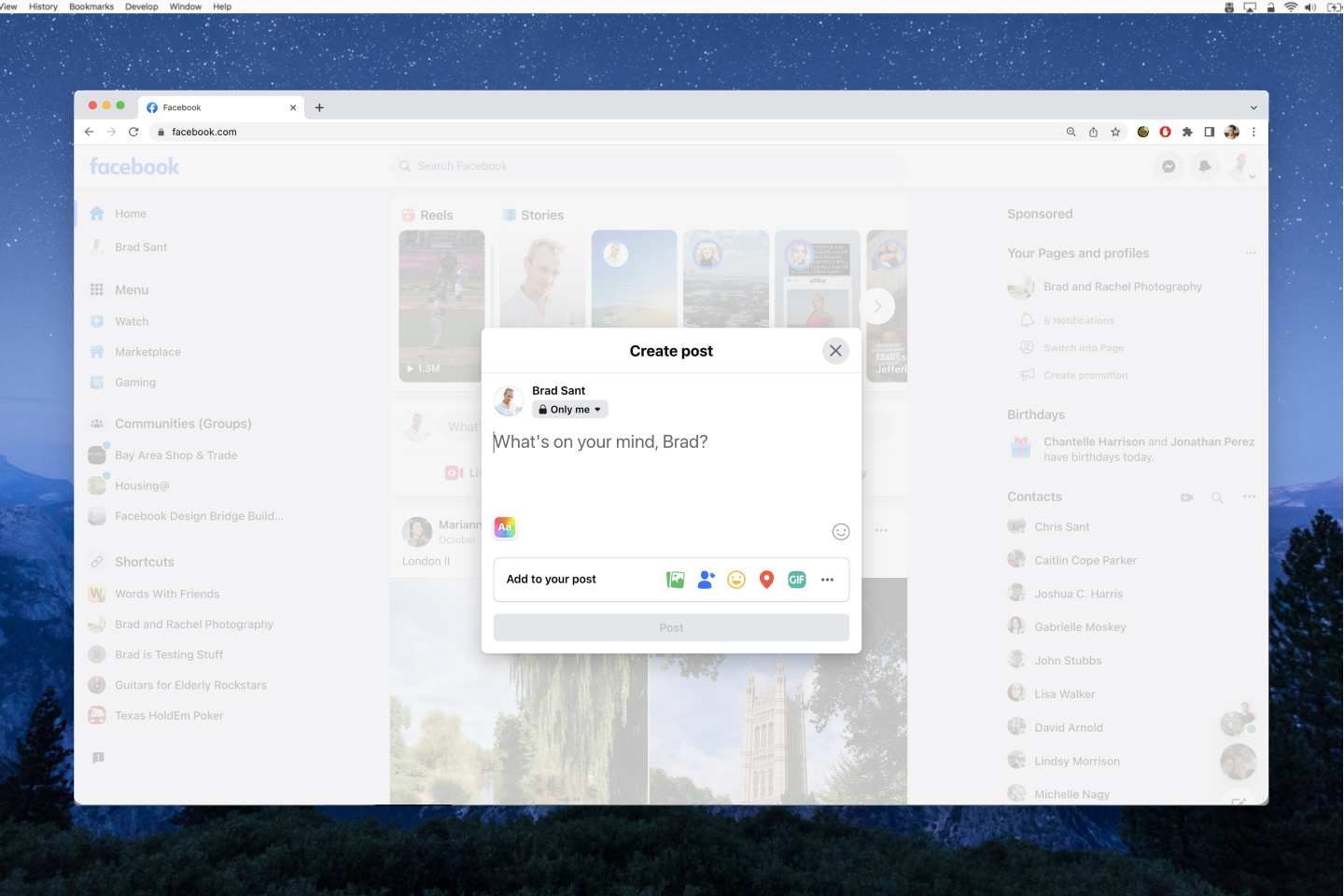
Before getting into any feature work, we ran a couple design sprints with other News Feed design & eng teams to nail down a foundational interaction model for the Composer.

We knew we wanted the configuration process to be broken down into more digestable steps, similar to an e-commerce checkout experience. But we needed input from other stakeholders on how well the interaction model would translate to their respective Composer-like experience (Groups, Pages, Marketplace, Going Live, Stories, and a few others).

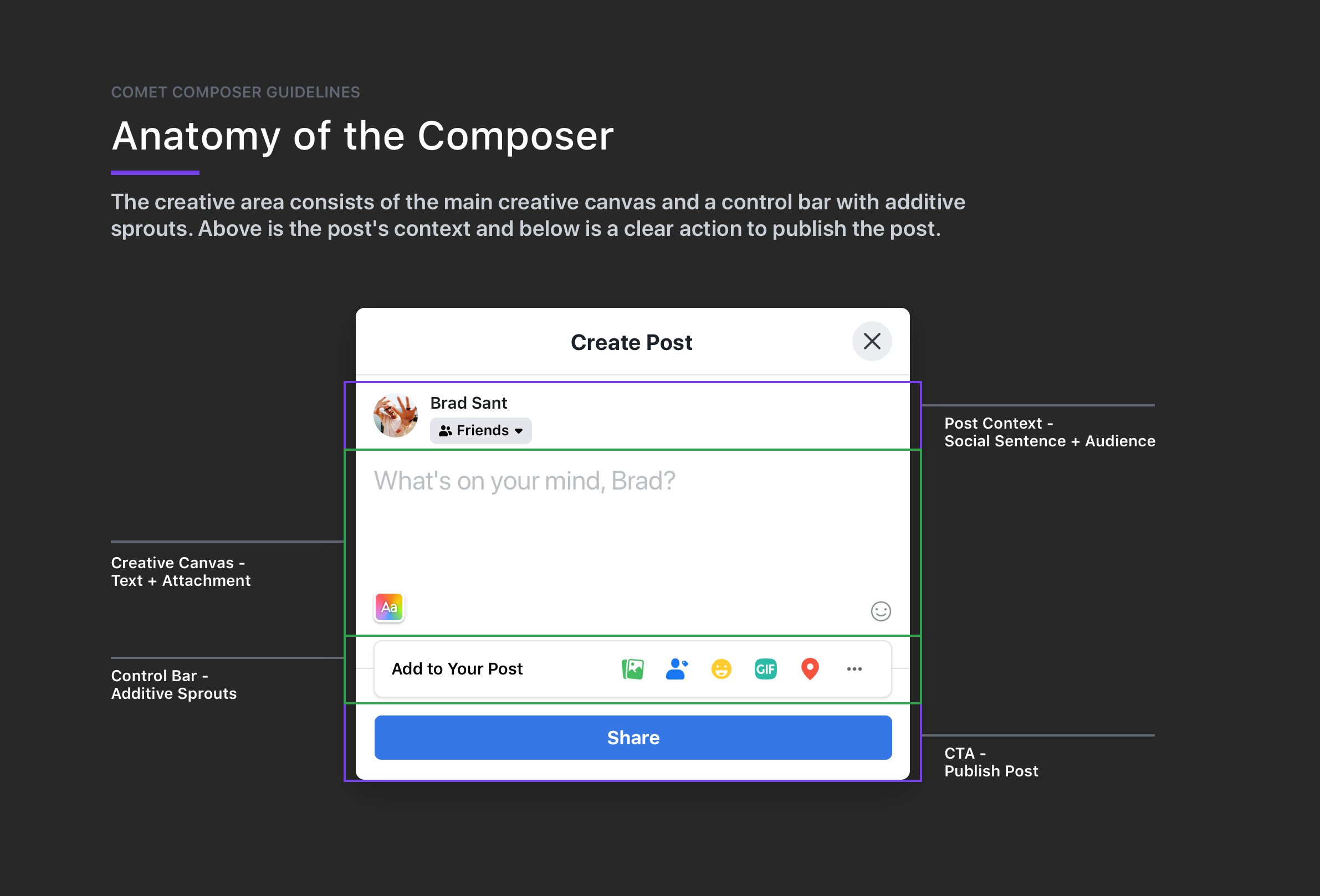
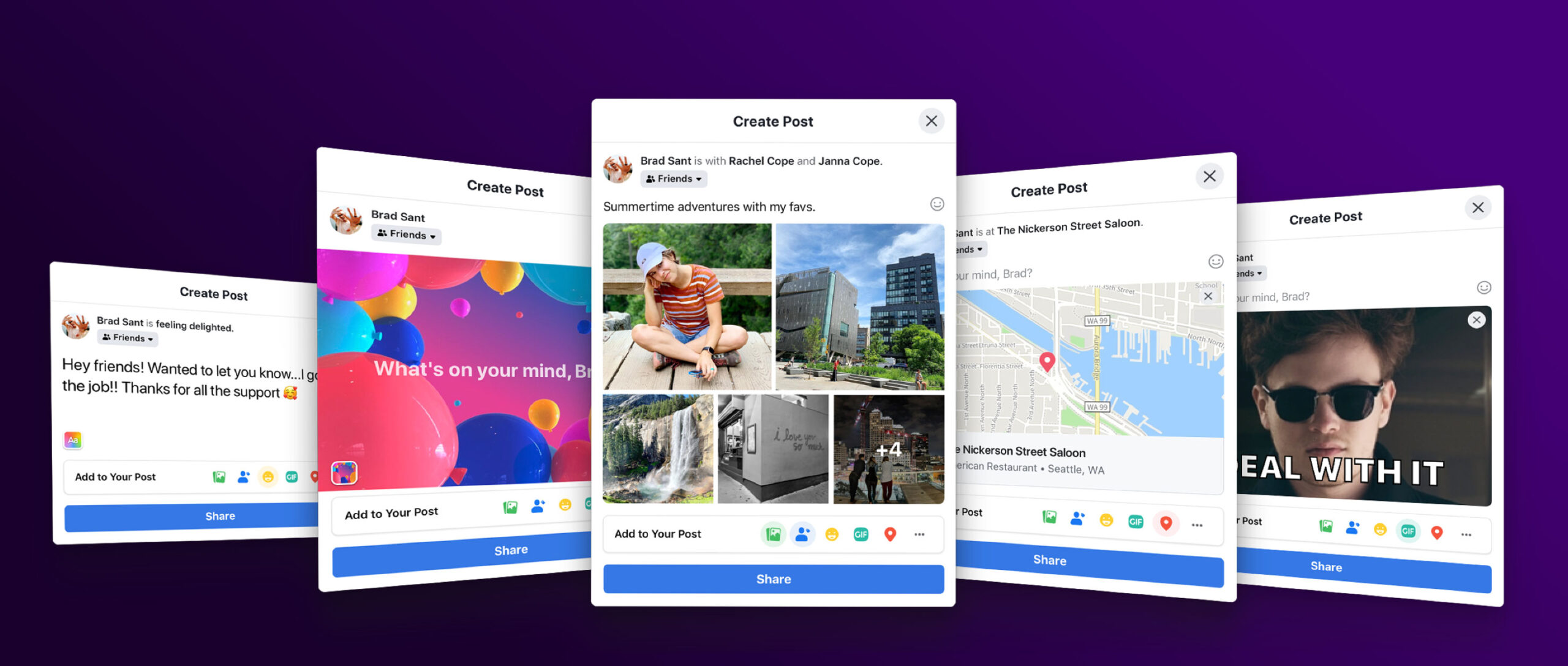
After a few weeks, we landed on a structure that surfaced key components while reserving enough room for a visual preview of your post before publishing.

An illustration used as the foundation for any designs that went into Web Composer 2.0

Lots and lots of editing features

When we started this project, I thought “no big deal, we’ll re-skin the existing features. How hard could it be?!” I was quickly humbled once we dove in and audited all the features we needed to redesign.
We started by focusing on the core features like text, emojis, SATP (Super Awesome Text Post) and GIFs. Then we budgeted an entire 6 months to nailing the UX of adding photos/videos. It was particularly difficult to mimic masonry-type layout grid because it had some algorithms for positioning/sizing that were historically difficult to access and/or reuse.
After that, we shifted focus toward editing media, then circled back to polish smaller (but very impactful) features like tagging, minutiae (ie “feeling happy”), and location check-ins.

Demo of entry point, text, emojis, and GIF selector

Demo of SATP (Super Awesome Text Post) & the expanded list of available tools

Demo of adding photos/videos & reordering media

Demo of the photo editing panel

Demo of video editing panel

Demo of tagging friends, minutiae, & location checkin

Demo of posting to News Feed & browsing media within the published post 

Not all designs make it to production...

Midway through this whole redesign I proposed an idea that was written into a code-based prototype and tested by a small group of participants via Facebook’s monthly “rolling research”. 

The prototype showed how we might utilize horizontal real estate more efficiently by nesting tools in “wings,” and thus free up valuable vertical space for the visual post preview.

100% of usability participants loved the concept but it was deemed too expensive to build and maintain by our engineering leads, since we’d still need to build and maintain our original composer design for smaller web-based screens (ie tablets and chromebooks).

A prototype I made to show how we might utilize horizontal real estate more efficiently by nesting tools in “wings.”

But some get shipped later!

Almost a full year after I had moved over to the Meta Reality Labs team, I noticed a highly-requested feature had been shipped to production!

One of the coolest ideas we had was to allow someone to add media from their phone to the web composer. This feature would be especially useful for celebrity social media managers (ie Oprah Winfrey’s official FB page mgr) to quickly add photos or videos they’d captured that day straight into the Composer.

It’s a good way for people who manage pages or groups or businesses from their desktop to streamline their workflow. I was super excited when this idea was finally shipped!

Transferring media from my phone’s camera roll straight into the web composer

Preserving scalability with guidelines

New features are built into Facebook News Feed Composer all the time, and the clean structure of the composer would be compromised without a set of clear guidelines.
So we gathered qualitative research and narrowed down to four people problems that Web Composer 2.0’s design guidelines would address:

Principles:

  • People want to know what to do
  • People want to feel in control
  • People want to feel supported
  • People want to know what will happen next

Guidelines:

1

Show, don't tell

Let the product speak for itself—provide a predictable WYSIWYG preview of what will be published.
2

One step at a time

Reduce cognitive load by surfacing each feature's details in a "push state."
3

Stay focused

Keep the UI focused on what the user is doing. Reduce unnecessary clutter and optimize vertical real estate for the creative canvas.
4

Respect agency

Never make choices for someone. Honor intent, but always let someone choose what they want to do.
5

Meet them where they are

To minimize tooltip overload for promoted features, define a trigger that matches an intentional action to indicate interest in the feature.

#1 – Show, don’t tell

Let the product speak for itself—provide a predictable WYSIWYG preview of what will be published.

#2 – One step at a time

Reduce cognitive load by surfacing each feature’s details in a “push state.”

#3 – Stay focused

Keep the UI focused on what the user is doing. Reduce clutter and optimize vertical real estate for the creative canvas.

#4 – Respect agency

Never make choices for someone. Honor intent, but always let someone choose what they want to do.

(Bonus) – Meet them where they are

To minimize tooltip overload for promoted features, define a trigger that matches an intentional action to indicate interest in the feature.

Key Learnings

I worked on this project for over a year. We were a small team that totaled 4 people (1 design, 2 eng, 1 intern) but we chipped away at an intimidating amount of work.

I learned how to navigate large projects by breaking them into milestones. We were so much more organized when we could focus our energy on a piece or two at a time rather than trying to boil the ocean by doing it all at once.

I also learned the power of partnerships. We brought together dozens of experts from design, engineering, research, and prototyping backgrounds which resulted in intentional, considered product design.

Last, I learned the value of tradeoffs. We had a heap of really fun ideas that never saw the light of day because we chose performance over prettiness. Some features still haven’t shipped because we couldn’t get them to reach our high bar for performance and quality metrics.

It’s really cool to see people use this Web Composer and think, “I built that.”