First Impression
Because I’m a compulsive UX-er, I couldn’t help but to document my experience as I signed up for an began using Wealthfront. During onboarding, I paid special attention to the questions that came up and formulated some questions to better understand current user experience.
Top 3 Questions
- Onboarding – how do you establish trust with your user?
- From Green to Purple – what are the guiding principles?
- How many users login from mobile browsers? Could it be more tap-friendly?
1—onboarding
How do you establish trust with your user? I think Wealthfront is currently doing quite nicely employing user-friendly language to describe some of these terms that typically cause cognitive overload. The flow reminded me of Intuit’s TurboTax, which is a fresh breath of air.
One question I have is about accessibility testing. Contrast ratios seem fairly low in some subtext, and I’m curious how Wealthfront has been testing WCAG standards up to this point.
The other question is around intelligently storing user input so it can be applied in later situations where that info could potentially be auto-filled, which could save time and position Wealthfront as an even smarter adviser.


2—from green to purple
Branding colors are always a very forward-facing change, and it gets a lot of attention. I have a few theories behind the switch from green to purple, but I’d love to dive deeper into some of the guiding principles behind the rebranding efforts.
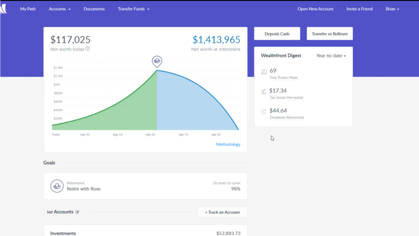
For example, color psychology tells me that green denotes the feeling of hope, growth, refreshment, balance, or reassurance whereas purple evokes feelings of creativity, individuality, quality, or royalty. I’m also curious if there’s something to do with moving away from the association to money, and instead pushing for something like life-planning or trust-related connotations…
I’d love to learn more about this change, I’m quite intrigued.
3—Mobile-friendliness
My first impression when I logged in on my phone’s browser was that not many users must be doing the same. My main question is how many users currently attempt to login from their phone’s browser, vs how many users does Wealthfront want to login from their phone’s browser?
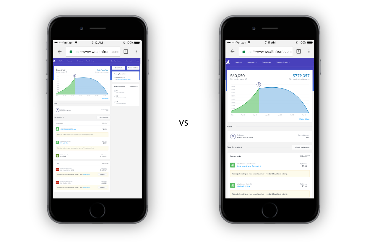
I am aware that there is an app, and I’m guessing the rationale behind a lackluster mobile browser experience is to drive more engagement with the more polished native experience.
However, if even 25% of mobile users try from their phone’s browser, tap-friendliness and readability may result in a lost opportunity…perhaps even something that drives mobile users from browser to native app download (like what is happening in Mobile Safari, but not Chrome) could improve mobile metrics.
Conclusion
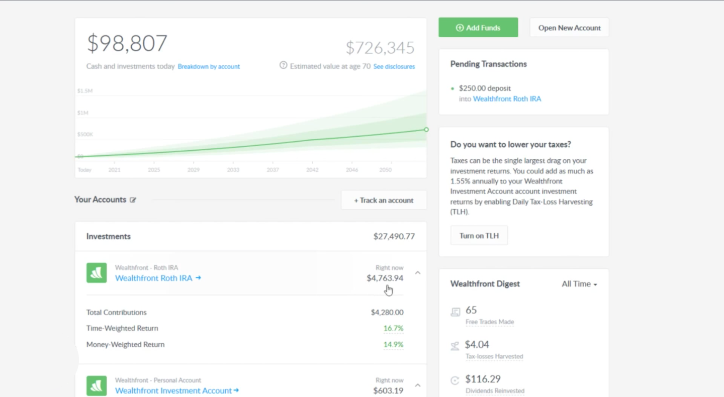
Overall, my first impression of the Wealthfront experience was a great one. The UI is much cleaner than what I’ve been used to (Fidelity, Vanguard) and the “what if” sliders and projection tools are a very nice touch.
One other piece I’d be curious to learn more about, however, is the capability to store account info and reuse it when necessary. For example, when I went to open a second or third account I was taken to the same questionnaire that I had filled out before. Is it possible to store the information I’ve already provided in the previous questionnaire and allow the option to autofill that info?
From start to finish, I setup my Wealthfront account (including transferring a ROTH IRA and poking around various options) in just under an hour. I’m wondering if storing and reusing info could shave valuable minutes off your user’s precious time.